

Part 3 · Projects, time and knowledge
BI dashboards and reports
Read and design spreadsheet dashboards, define named measures, then read and build interactive reports that filter the whole page with one click.
The Dashboards application brings the organization's figures together in one place: hours, revenue, margin, NPS, backups, hour banks. It comes in two forms. A dashboard is a spreadsheet you read at a glance, with its period and customer filters. A report reads like a BI tool: a click on a customer filters the whole page, and a right-click opens its detail page. This chapter is for everyone who reads these figures, and for the designers who lay them out.
Overview#
A dashboard is a spreadsheet that the viewer displays read-only: tiles, charts, pivot tables. Dashboards are filed by section in the viewer's left column: BI, Sales, Finance, Services. Two filters, Period and Customer, recalculate the whole page.
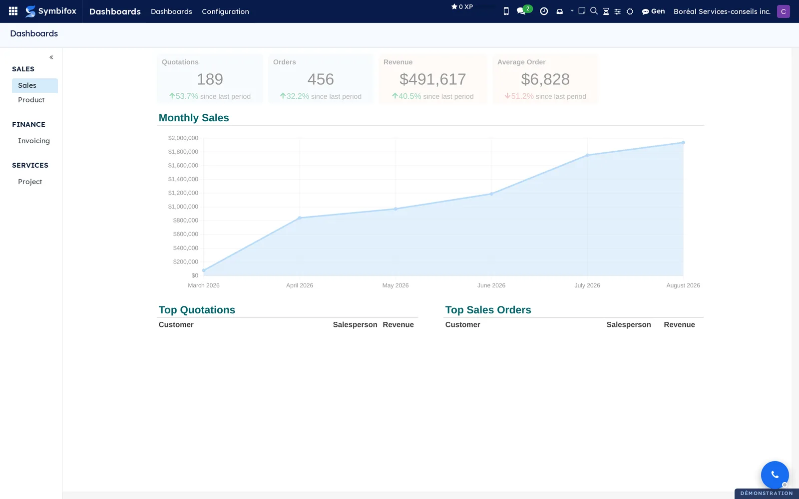
A named measure is a figure defined once and reused everywhere: hours, revenue, margin, margin rate. It is either an aggregate (a sum, an average or a count over an Odoo application) or a formula that combines other measures. Its value is always computed for the person looking, under their own access rights: a consultant sees her hours, management sees the whole team's, in the same dashboard.
A report is a page laid out on a twelve-column grid, made of visuals: tiles, column, bar, line and donut charts, tables, gauges, waterfalls and heat maps. Its Period and Customers slicers sit at the top of the page. A click on a bar, a slice or a row filters the whole page; a right-click on a customer opens its detail page. A report has pages, shown as tabs at the bottom of the screen. Its figures are the same named measures the dashboards use.
The two forms complement each other. A dashboard presents, with the free layout of a spreadsheet. A report lets you dig: it answers "which customer?" without an export or a fresh pivot table.
Configuration#
Access and permissions#
- Reader (any internal user): opens the dashboards and reports opened to one of their groups. Every figure is computed under their rights: a line they cannot read elsewhere in Symbifox does not count.
- BI Designer: designs and edits dashboards, named measures and reports, and sees their versions. A new dashboard or report stays with designers until it is opened to other groups.
- Share a dashboard by public link: reserves the viewer's Share button, which publishes a snapshot by link.
- Administration: the only role that sees and sets up Data connections, and an external source's access key.
Settings#
Nothing in Settings. A dashboard is set up on its own form (section, Visible to), and so is a report (Visible to, Theme). The colors of the Company colors theme come from the company's document layout.
Base data#
Nothing is required. The shipped templates are enough to start: four dashboards in the BI section (professional services, hour banks, hosting, customer experience) and five reports ready to create. Each installs with the application it reads. For your own figures, first create the named measures you need.
Getting started#
Camille Tremblay wants to know which customer explains the drop in revenue this year.
- Go to Dashboards › Reports.
- On the Management report row, select Open.
- Leave the Period slicer on This year: the tiles compare year to date with the same dates last year.
- Read the Revenue: what changed waterfall: it starts from the previous period, adds each customer's change, and lands on this year's total.
- In the heat map, select the name Groupe immobilier Vaudreuil.
- The whole page recalculates for that customer; the Filtered by chip under the slicers says so.
- Press Esc to go back to everything.
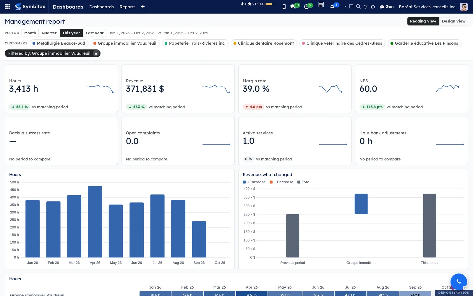
Three clicks, and Camille knows where the change comes from, without an export or a pivot table.
Common tasks#
Read a dashboard#
- Go to Dashboards › Dashboards.
- In the left column, select a dashboard under its section.
- Set the Period filter (the current year by default) and, if needed, the Customer filter.
- Read the tiles: the green or red arrow compares with the matching period.
A tile built from a named measure compares year to date with the same dates last year, never with the whole year. A rate or a score moves in points rather than in percent. The pencil next to a name opens the editor, for designers.
Design a dashboard on screen#
Before you start: you need the BI Designer group.
- Go to Dashboards › Design.
- On the row you want, select Edit, or Duplicate and edit for a dashboard shipped by a module.
- Place your tiles, charts and cells as you would in a spreadsheet.
- For a figure, select Insert a measure, tick one or more measures, then place them as tiles or in cells.
- Stop typing: the editor saves after a second and a half of inactivity and shows Saved.
- Select View the dashboard to go back to the viewer.
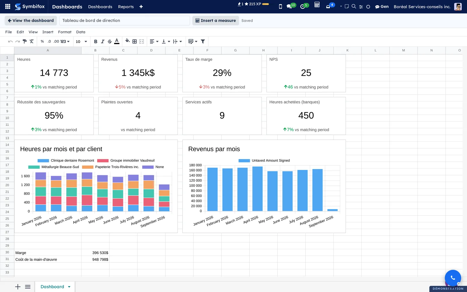
If a colleague saved while you were working, nothing is overwritten: you choose between reloading their version and replacing it with yours, theirs staying in the versions.
Add a view to a dashboard#
Before you start: you need the BI Designer group.
- Open a pivot or graph view in any application, for example timesheets.
- Set its measures, groupings and filters.
- Select Add to a dashboard.
- Choose the form: Pivot table or Indicator (or Chart from a graph view).
- Choose New dashboard and name it, or select an existing dashboard.
- Select Add and open.
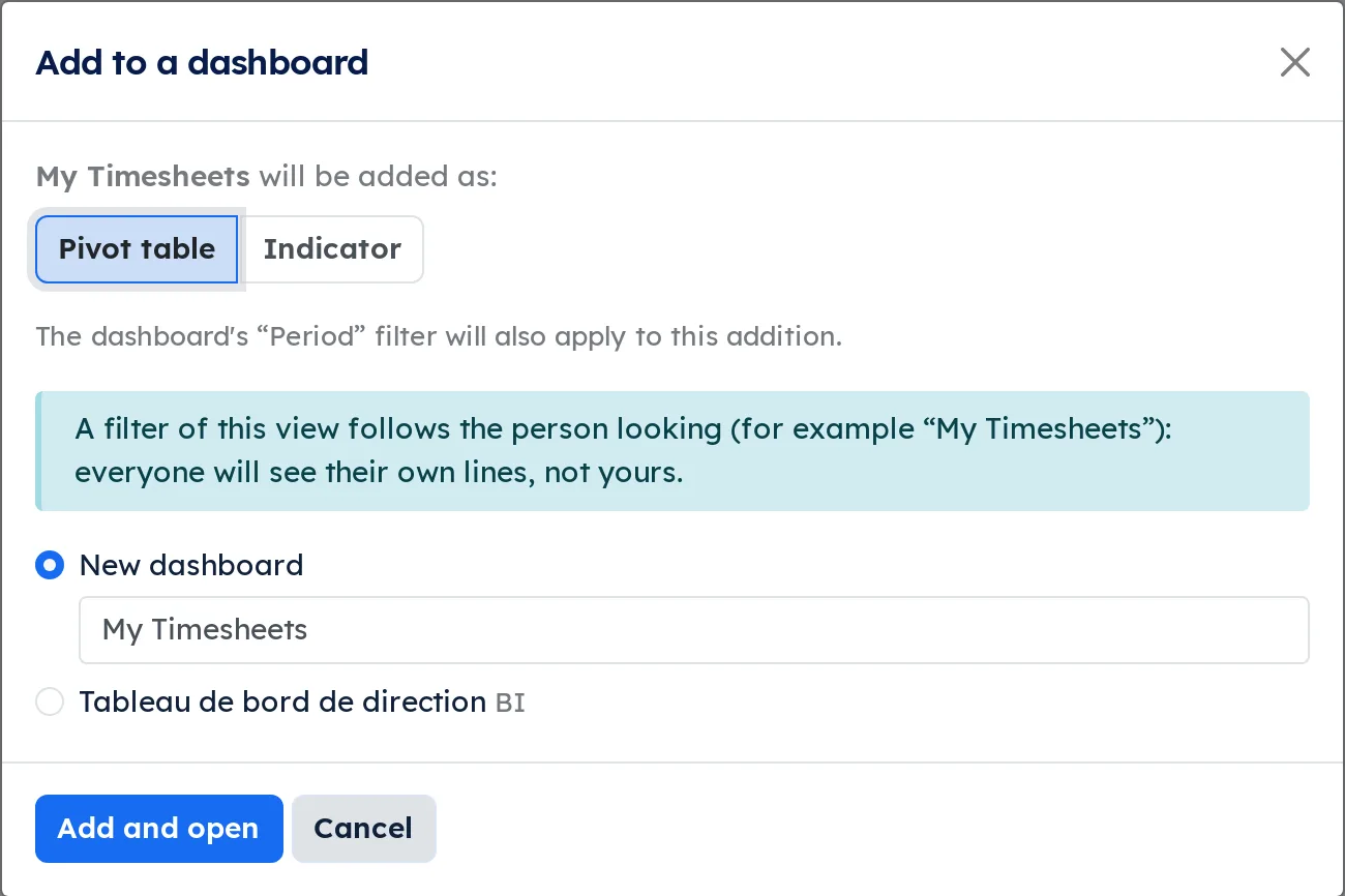
The first addition creates the Period and Customer filters, and every later one links to them. A filter such as "My timesheets" follows the person looking: everyone sees their own lines.
Create a named measure#
Before you start: you need the BI Designer group.
- Go to Dashboards › Named measures, then select New.
- Enter the Name and a short Code (lowercase letters, digits and underscores).
- Choose the Kind: Aggregate or Formula.
- For an aggregate, choose the Model, the Aggregation, the Field, the Date field and the Customer field, then a Filter if needed.
- For a formula, enter the codes of other measures joined by "+", "-", "*" or "/", for example "margin / revenue".
- Choose the Unit and how to Compare with previous period (In percent or In points).
- Select Test to see the value, then save.
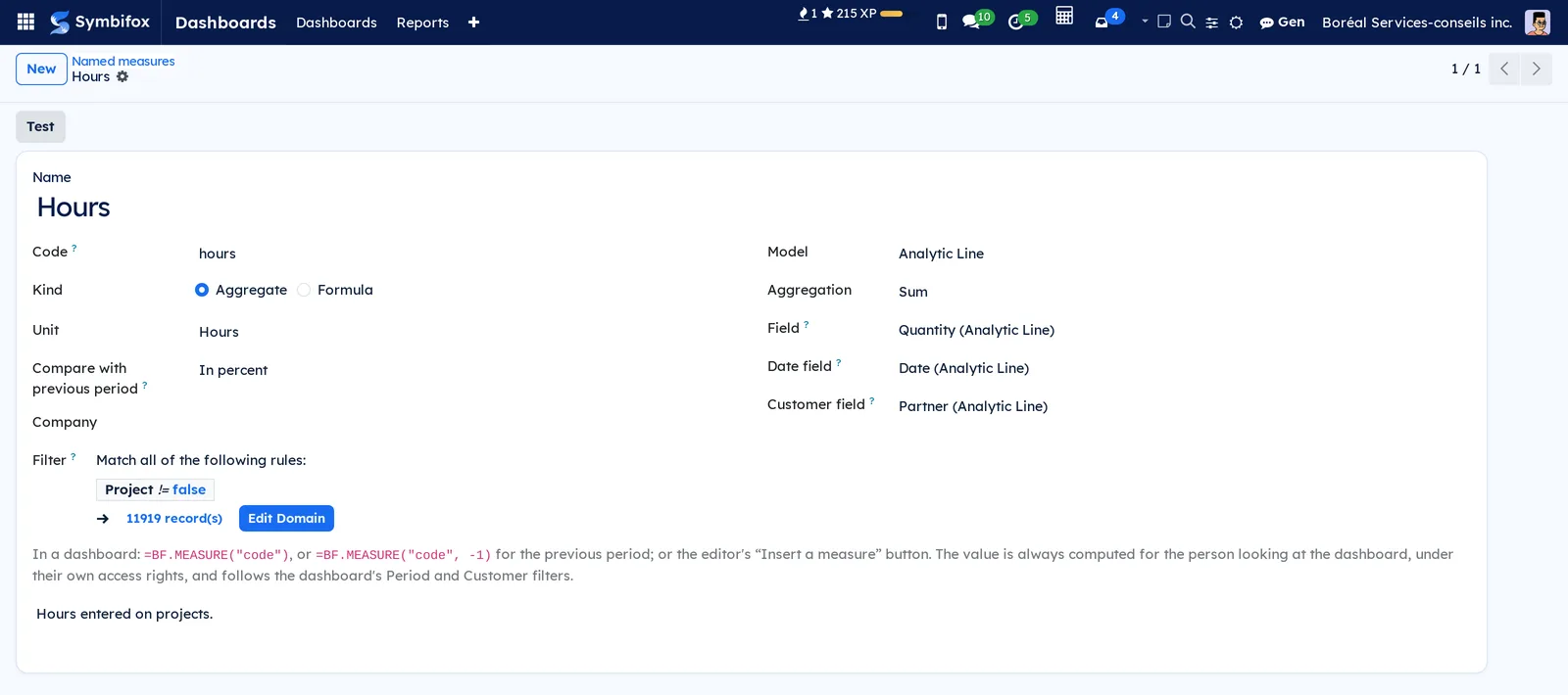
A division by zero gives an empty cell rather than an error: a margin rate over a period with no revenue stays empty, which is truer than a zero.
Open a dashboard to other groups#
- Go to Dashboards › Design and open the dashboard's form.
- In Visible to, add the groups that should see it.
- Save.
Opening a dashboard shows no extra figure: each reader only sees what their rights allow.
Restore a version of a dashboard#
- Go to Dashboards › Design and open the dashboard's form.
- Open the Versions tab: the last thirty, with their author and date.
- On the version you want, select Restore.
The chosen version becomes a new revision: the current one stays in the list, and nothing is lost.
Connect an external source#
Before you start: you need to be part of the administration.
- Go to Dashboards › Configuration › Data connections, then select New.
- Enter the Name, the Code, the Grist server address, the Grist document ID and the Grist API key.
- Add the allowed groups or people.
- Save.
A connection is closed by default: until someone is allowed, nobody sees its data. In the editor, Insert a source spills a Grist table into the sheet, read on behalf of the person looking.
Read a report#
- Go to Dashboards › Reports.
- On the report's row, select Open.
- Choose the Period: Month, Quarter, This year or Last year. The line next to it shows the dates being compared.
- If needed, remove customers with their chips in the Customers slicer.
- Switch pages with the tabs at the bottom of the screen.
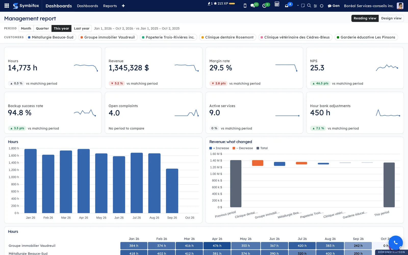
A tile shows the value, the last twelve months and the change against the matching period. A heat map darkens where figures pile up, and every cell carries its value in writing.
Filter the whole page with one click#
- In a report, select a bar, a donut slice or a table row.
- Read the page recalculated for that customer or month; the Filtered by chip says so.
- To go back, press Esc or select the chip's ×.
In the visual you clicked, the other marks fade back instead of vanishing. A clicked month replaces the period: tiles and comparisons then cover that month, against the same month last year.
Open a customer's detail page#
- In a report that has a detail page, right-click a customer (bar, slice or row).
- Choose Drill through › followed by the detail page's name. In a table by customer, Detail › at the end of the row does the same from the keyboard.
- Read the page filtered on that customer.
- Switch customers with the Detail of list, or go back with ← Back.
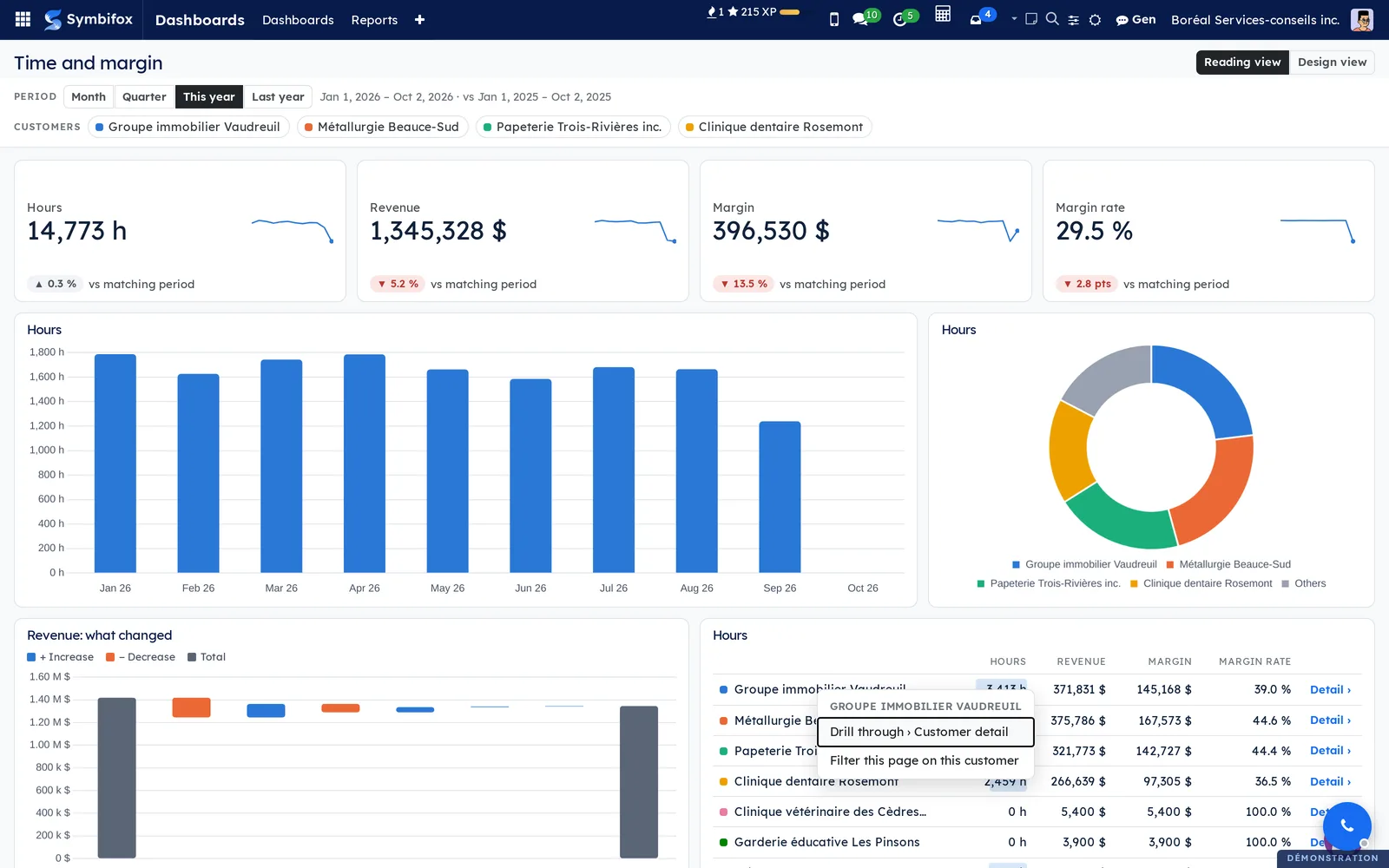
The menu also offers Filter this page on this customer, to stay on the current page. Opened from its tab, a detail page first asks you to choose a customer.
Explain a change with a waterfall#
The waterfall starts from the previous period and lands on today's number.
- Open a report with a waterfall, for example Management report.
- Read the first grey bar (the previous period) and the last one (this period).
- In between, read each customer's change: blue for an increase, orange for a decrease, biggest change first.
- Hover over a bar to read the before and after values.
A lost customer weighs as much as a new one. The rest goes to Others, lines without a customer included: the bars always land exactly on the total. By month, the waterfall adds each month to the previous one up to the year's total.
Create a report from a template#
Before you start: you need the BI Designer group.
- Go to Dashboards › Reports.
- Select From a template.
- Choose a template; its description shows underneath.
- Select Create the report: the report opens.
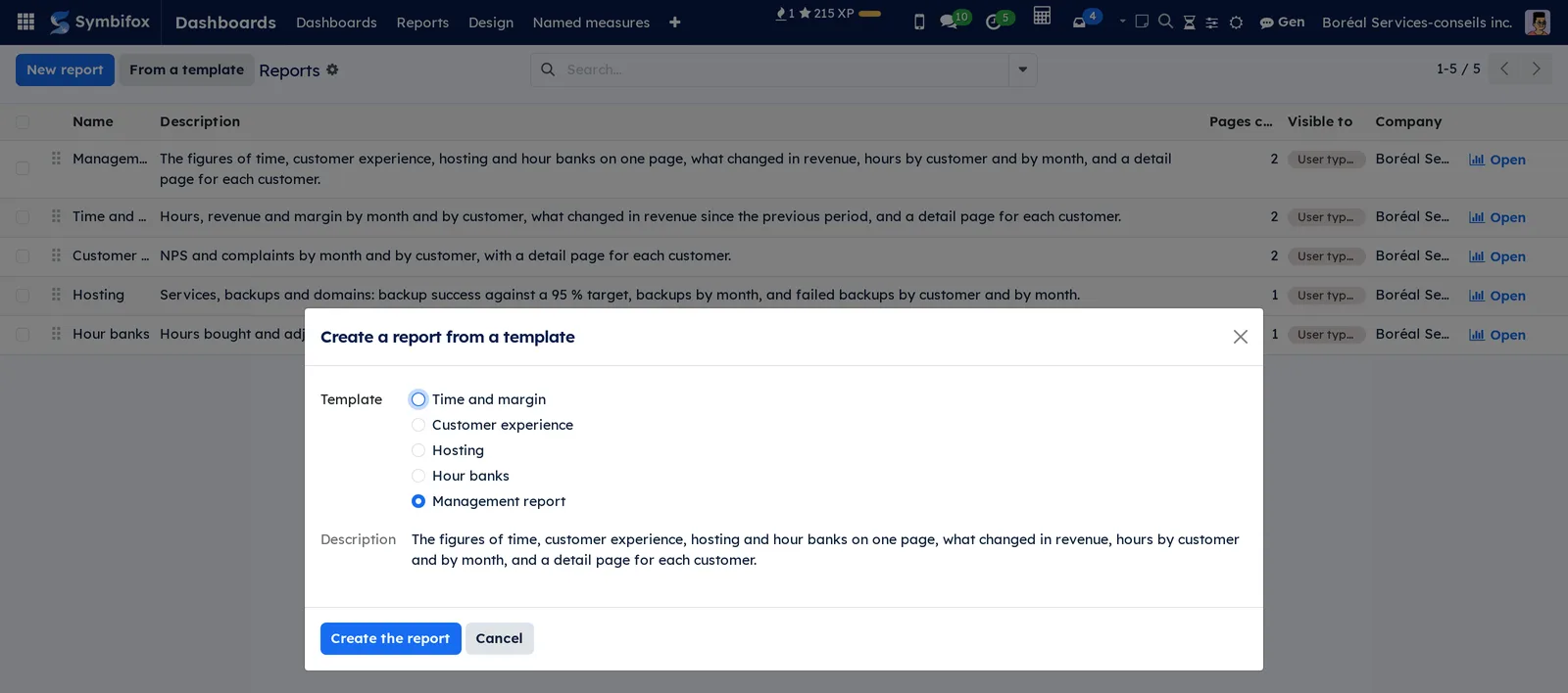
A template is only offered once the application it reads is installed; otherwise the window says what is missing. The new report is named in every installed language, and edits like any other afterwards.
Design a report on screen#
Before you start: you need the BI Designer group.
- Open the report, then select Design view at the top right.
- Under Visualizations, select + Visual, then the type: tile, column, bar, line, donut, table, gauge, waterfall or heat map.
- Under Fields, drag a dimension (month, quarter, year, customer) into Axis and a measure into Values. A click on a field adds it too.
- If needed, set the title, the Target, a gauge's Maximum or the number of Customers shown.
- Drag the visual to move it; its corner handle resizes it.
- For a page, enter its name, tick Detail page for one customer (drill-through), or fix the Period of the page and the Customers of the page.
- Select Reading view: the report has saved itself.
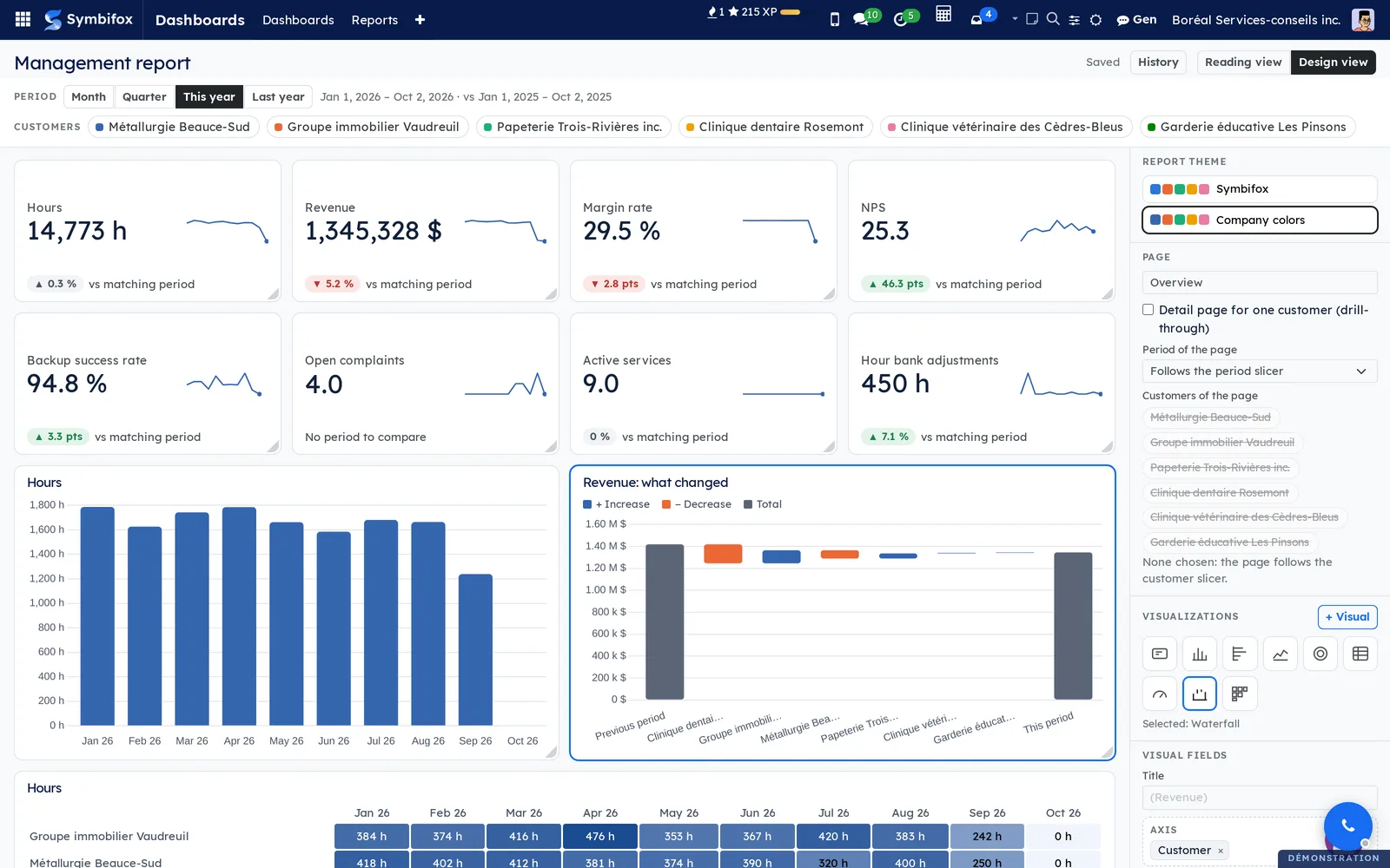
A warning shows when a measure cannot follow the period or be split by customer. A waterfall refuses a rate or an average, with the reason: those figures do not add up. The Report theme picks the palette: Symbifox or Company colors.
Restore a version of a report#
- Open the report, then select Design view.
- Select History: the last thirty versions, with their author.
- On the version you want, select Restore version.
If a colleague saved while you were working, a banner says so and nothing is overwritten: Reload their version or Keep mine.
Open a report to other groups#
- Go to Dashboards › Reports and open the report's form.
- In Visible to, add the groups that should see it.
- Save.
A report with no group stays visible to designers only.
The menus, one by one#
Dashboards: root menu, which opens the viewer directly (the same screen as the next submenu).
Dashboards › Dashboards: the viewer. On the left, the sections and their dashboards, with a pencil for designers and a chevron to collapse the column. In the centre, the chosen dashboard under the Period and Customer filters, and the Share button for those allowed.
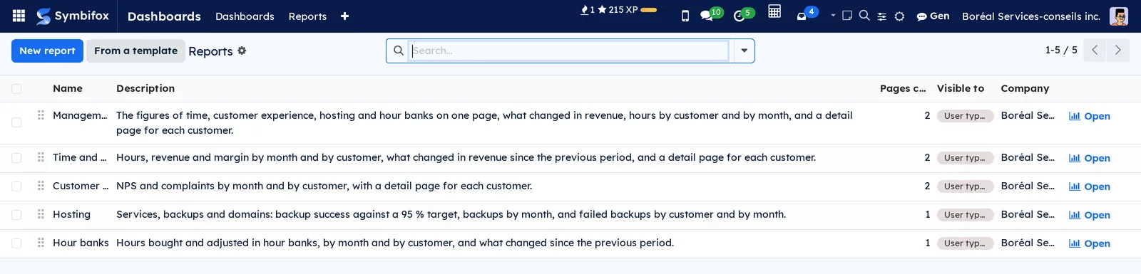
Dashboards › Reports: the list of reports, with the Name, Description, page count, Visible to and Company columns, and the Open button on each row. Designers find New report and From a template there.
A report's form carries the Open the report button, its Description, Visible to, Company, Theme and the list of its pages, with their Drill-through page and Fixed period. Form screenshot: m1253_form.png.
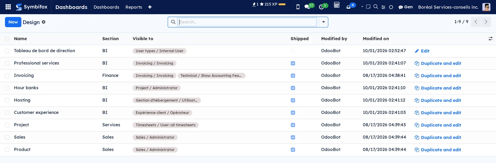
Dashboards › Design: the list of dashboards for designers, with the Name, Section, Visible to, Shipped, Modified by and Modified on columns, and on each row Edit or, for a dashboard shipped by a module, Duplicate and edit.
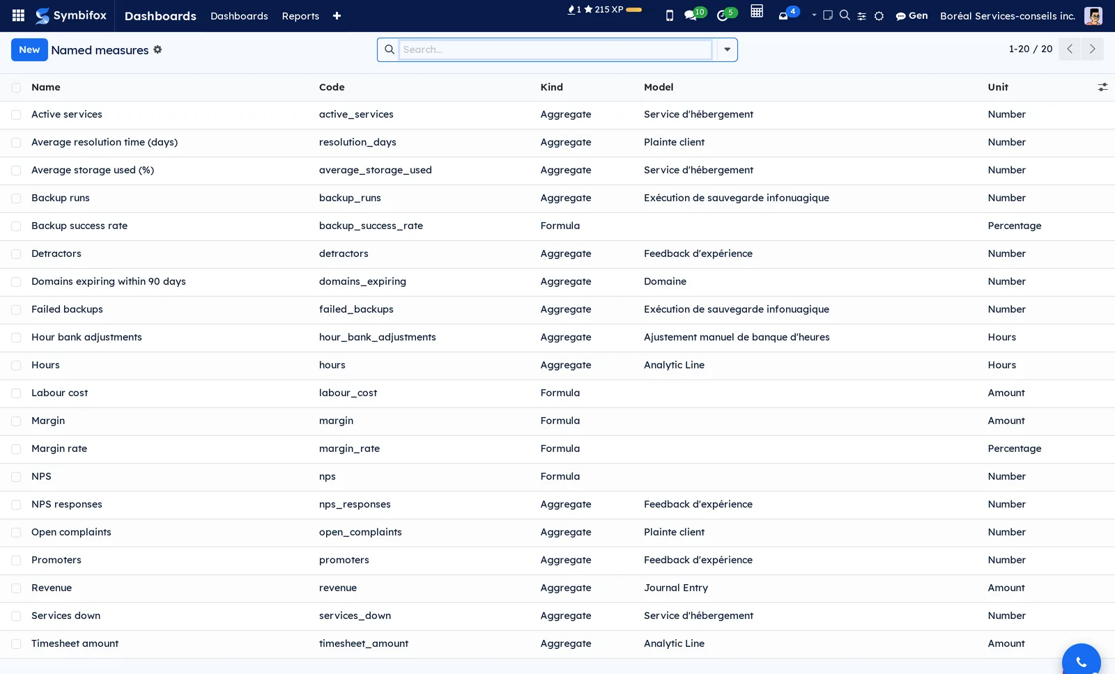
Dashboards › Named measures: the list of measures, with the Name, Code, Kind, Model and Unit columns. The demo holds twenty, from hour bank adjustments to the backup success rate.
A formula's form, such as the margin rate, carries its Formula instead of the model and fields. Screenshot: bi_mesure_formule.png.
Dashboards › Configuration: grouping menu.
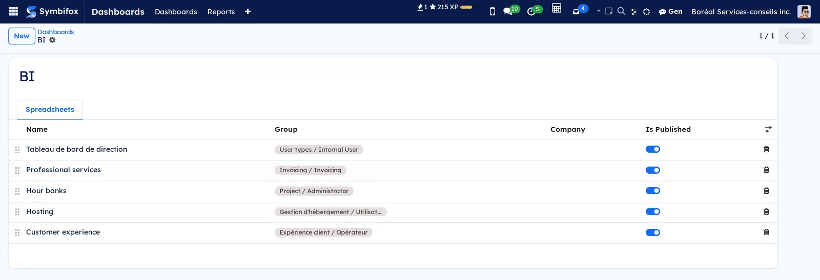
Dashboards › Configuration › Dashboards: the list of sections, from BI to Human Resources, with a handle to change their order in the viewer's left column. A section's form lists its spreadsheets and their group.
Dashboards › Configuration › Data connections: external sources, reserved to the administration. Empty on the demo, the screen invites you to connect an external source. Screenshot: m1233.png.
Reference#
Fields of the Named measure form#
| Field | Description | Required or default |
|---|---|---|
| Name | The name shown on tiles and in the panes. | Required |
| Code | The short name used in formulas, in lowercase. | Required |
| Kind | Aggregate or Formula. | Aggregate |
| Unit | Number, amount, percentage or hours: decides the display. | Number |
| Compare with previous period | In percent or In points (for a rate or a score). | In percent |
| Model | The application an aggregate reads. | Required for an aggregate |
| Aggregation | Sum, average, minimum, maximum or count. | Sum |
| Field | The value summed or averaged. | Empty (the number of lines) |
| Date field | The date the Period filter follows. | Empty |
| Customer field | The customer the Customer filter follows, and reports split by. | Empty |
| Filter | Keeps only some lines. | Empty |
| Formula | The codes of other measures, joined by + - * / and parentheses. | Required for a formula |
Fields of the Report form#
| Field | Description | Required or default |
|---|---|---|
| Name | The report's name, in every language. | Required |
| Description | What the report shows. | Empty |
| Visible to | The groups that find the report in the list. | Empty (designers only) |
| Company | The report's company. | The active company |
| Theme | Symbifox or Company colors, chosen in design mode. | Symbifox |
Fields of the Data connection form#
| Field | Description | Required or default |
|---|---|---|
| Name | The source's name. | Required |
| Code | The short name cited in a sheet. | Required |
| Type | The kind of source. | Grist |
| Grist server address | The server's address. | Empty |
| Grist document ID | The document read. | Empty |
| Grist API key | The access key, visible to the administration only. | Empty |
| Maximum rows | The number of rows read per table. | 5,000 |
Reports and exports#
A dashboard is shared by public link with Share, for those allowed: the link shows a frozen snapshot. A pivot table in a dashboard leads, as everywhere, to the detailed lines. A report does not print: it is read on screen, and a click on a figure leads to the page that explains it.
Automations#
- Figures are recalculated on every opening, under the rights of the person looking.
- Dashboards and reports save themselves in design mode.
- Dashboards shipped by a module are rewritten on every update; a copy made with Duplicate and edit stays yours.
- Measures shipped by the templates are created only once: your adjustments are never overwritten.
- An external source keeps its data in memory for a minute, and reads it again as soon as the connection changes.
Modules that extend this application#
The first dashboard template, Professional services, shows hours, revenue, labour cost and margin, by customer and by month.
The second, Hour banks, shows balances and the hours added or removed.
The third, Hosting, follows services, backups, storage and domains.
The fourth, Customer experience, brings NPS and complaints together.
Understanding#
Everyone sees their own numbers, with nothing to rebuild. A BI tool plugged in on the side would read the database without Symbifox's access rules. Here, every tile, cell and visual is recalculated under the rights of the person looking, never as an administrator. Opening a dashboard or a report to a group therefore shows no figure that group could not read elsewhere.
The matching period, not the whole year. Comparing year to date with the whole previous year would show a drop every spring. A named measure compares with the same dates last year: 1 January to today, against 1 January to the same date. A period in progress stops at today, so a future due date does not skew the comparison.
Why a waterfall refuses a rate. A waterfall adds up: the previous period plus the changes gives the current period. A margin rate or an average delay do not add up from one customer to the next; the waterfall refuses them rather than show a wrong total. It also refuses a measure part of which does not know the customer: that part would count in full for every customer.
Dashboard or report? A dashboard gives you the freedom of a spreadsheet: any cell, any text. A report is more structured, but it filters with one click and leads to a customer's detail. Both read the same named measures: one definition of the margin serves everywhere.
What the application does not do. No data warehouse, no connectors to dozens of programs: it reads Symbifox, and Grist through a connection. For many sources to combine, a specialized tool remains the right choice.
Troubleshooting#
| Symptom | Likely cause | Fix |
|---|---|---|
| A dashboard or report is missing from the list. | It is not opened to any of your groups. | Ask a designer to open it in Visible to. |
| A tile shows less than a colleague's. | Figures follow your rights: you do not read the same lines. | This is intended; one more group widens what you read. |
| A waterfall shows a message instead of bars. | The measure is a rate, an average, or part of it does not know the customer. | Choose a sum or a count, or show the rate in a gauge. |
| A tile reads "No period to compare". | The measure has no date, or the previous period is empty. | Fill in the measure's Date field. |
| The right-click menu does not open on a customer. | The report has no detail page, or the visual does not show customers. | Tick Detail page for one customer (drill-through) on one of the report's pages. |
| A banner says a colleague saved. | Two people changed the same report at the same time. | Choose Reload their version or Keep mine; the other version stays in the History. |
| An external source cell shows an error. | You are not allowed on the connection, or its code is unknown. | Ask the administration to allow you on the connection. |
See also#
- My desk, Dashboard and Progress: the unified dashboard of the main bar.
- Timesheets: the hours that the time and margin measures read.
- Invoicing: the revenue in dashboards and reports.
- Hour bank: the balances in the Hour banks dashboard.
- Customer experience: NPS and complaints.
- Common actions in every application: the pivot and graph views you add to a dashboard from.